

November 2009 Community School of Music & Arts
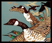
Hummingbird Co-pilot is part of a series about bird migration myths. People used to believe that hummingbirds were way too small to travel on their own, so, they made up a story that the little birds hitched a ride atop the backs of Canadian Geese.
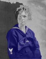
My grandmother retained her daring and boldness into extreme old age. Off To Sea is from a 1916 photo of her in a forbidden Navy uniform which she made into postcards and sent out, much to her family’s horror, during WWI. That generation, born around 1900, called the New Moderns, Jazz Generation, Lost Generation, were the first women to vote, crop their hair, drive, think globally, go to films, live with the fast, new technology.
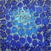
Splash Two
Lynne Taetzsch
acrylic on canvas 40” x 40”
I paint with acrylic on canvas, letting one layer dry before working again the next day. I did a series recently with layers of circles, and a final layer of leaf-like shapes on vines. In each one I focused on a narrow color range—reds to orange, browns to yellow, or shades of blue in three Splash paintings.
In each canvas, I sought a central focus of light radiating out toward darker shades to build up the visual impact. In the first painting in this series, each step came out of the moment, unplanned. In subsequent canvases, I explored this theme further.
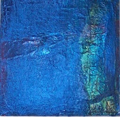
I am a red person, seeking its intensity and light. When I am burned out by red, I turn to cool blues. In the Splash series, I dive into the watery depths to come out refreshed and at peace.
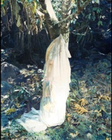
Divine Alchemy
Mariann Loveland
oil on canvas, 60” x 48”
A reoccurring theme in my work throughout my painting carrier, the draped figure continues to fascinate me. Vedanta philosophy speaks of the gradual pealing away of the layers of skin of an onion as a metaphor for the work required in the elimination of various facades of mistaken identity that hide the authentic self. In this painting transparencies of cloth reveal hints of what lies beneath. As the eye penetrates the chrysalis one can begin to piece together the form of a figure with an arm reaching upward . When the figure emerges the metamorphosis is complete revealing the true beauty within.
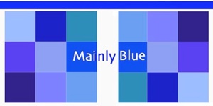
Mainly Blue Statements
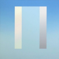
Zodiac
Michael Boyd
acrylic on canvas 42" x 42"
Although my paintings have always been "abstract" they maintain strong links to ordinary visual experience, in which color plays a major role. What we casually call "blue" is, of course, a very complex array of variations of a specific hue (Blue rather than "blue"). In my work from the period that includes Zodiac (1970), color functions as a stand-in for light.
The popularity of the color blue seems obvious, since it evokes so many things we are fond of: blue skies, bodies of water, etc. In spite of innumerable variations we seem to know when we are looking at some kind of "blue.”
The painting in the exhibition, Zodiac, is from my early years in Ithaca. I fell in love with the light and space of this region, which has remained a great source of inspiration to me.
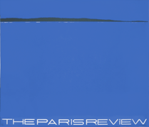
Paris Review Poster Edition of 150
Steve Poleskie
silkscreen 24.75" x 29"
In 1964 Drue Heinz made a gift to The Paris Review to enable the magazine to initiate a series of prints and posters by major contemporary artists, the purpose of which was to encourage works in the print medium while publicizing The Paris Review and providing financial support for the magazine. Largely through the efforts of Jane Wilson, a fellow artist and the director of the program, twenty-three artists—among them Andy Warhol, Robert Rauschenberg, Helen Frankenthaler, and Robert Motherwell—were persuaded to donate signed and limited editions of original work.
The tradition continues in the present day with the publication in recent years of prints by Louise Bourgeois, Ed Ruscha, and William Bailey. Each print is published in an edition of 60 to 200, most of them signed and numbered by the artist. All have been made especially and exclusively for The Paris Review.
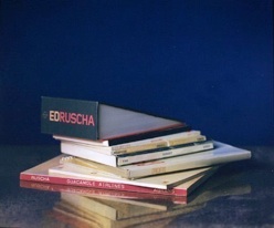
My Ruscha, 2000
Buzz Spector
Polaroid interior dye diffusion print
20” x 24” on 29” x 31” paper
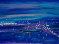
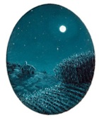
I want my night scene paintings to reflect the mystery of the nocturnal world and how the night sky opens the heavens to the eye. I wish to have a viewer share in my experience of the limitless beauty of the physical universe that is there for all lovers of the night to see as the stars twinkle in their spangled mantle over the earth. to feel the rhythms of the cosmos under the light of a full moon as it bathes the landscape with dancing highlights. I hope to invite a viewer to gaze deeper into the shadows cast by the moon and have imagination set free.
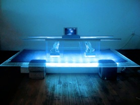
Blue Blood
Video Installation/ Exterior Wall Projection
John Criscitello
Blue is always there for me and I don't know why. Perhaps it's because so many things I love are blue - the sky, water, my husband's eyes. I have more tubes of blue paint than any other, so it has to be something primal.
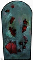
While the “Faith” series is abstract, it references stained glass windows, making the hue a natural choice. However, some paintings in this series reflect struggles with faith, religion and spirituality, with nary a blue in sight. In contrast, #5 and #6 are about final resolution, peace and acceptance.
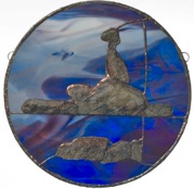
Bird
Linna Dolph
glass,stone, solder 14"D
Trees Along A River
Linna Dolph
glass, solder, stainless steel 12" X 36'' X 6''
Grant support from the Community Arts Partnership NYS Council on the Arts
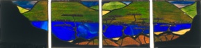
“Lift Off” represents an assemblage of patterns on the ground that are evident when viewed from the air: fields, forests, lakes, and sculpted terrain. I used fabrics that I dyed and painted, and suspended the layers of earth patterns with plexiglas rods.
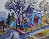
Into The Night
Carol Spence
mixed media 24” x 30"
Working from the front seat of my van, I chose this subject that I've seen so many times before. Painted well before spring, the angles of the house on East State Street caught my eye. Only this day, it was raining. Painting wet-in-wet on the rainy day, I was informed by a parking control officer that because of the time of day, I was illegally parked, so I moved on.
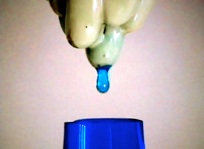
The color blue is for the sky, and water. Many shades of blue are seen and experienced. Ultramarine blue was my favorite one for a long time. For this print I used cerulean blue for one plate, orient blue for the second plate, both spit-bite aquatint and the third plate was sugar lift aquatint with silver. Three copper plates were used to create this image. Perhaps a view of a river through an iron gate, or as the title suggests, someone tries to catch water with an open net, an impossible task. Is it impossible, too, to keep our water clean for the creatures on this planet?
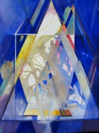
This painting is one in a series of abstract paintings which allows the viewer to participate within the space, color and movement of the painting. So, in a sense the viewer becomes the figure within the inner space of the painting relating to the environment imposed by myself through his/her own experiences. I have left the relationships of shapes and space purposely ambiguous as a trigger to allow the viewer to enter the space.
Satterly Hill II is part of a series of monotypes that I created from being close to nature. Satterly Hill is the place which I have called home for almost ten years. I enjoy the woods, the fields and the vineyards and thus this environment often finds an immediate entrance into my work.
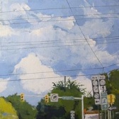
This painting is a mix of ideas and techniques. I had wanted to paint Ithaca road route signs for some time and was looking through photos I had taken of dramatic clouds and came upon the photo reference for this painting. I’m sure I first put in the clouds very loosely, then painted the trees, signs and traffic signals toward the end. Finally, I laid down some blue painter’s tape to create the thin utility lines. I was watching the Bob Dylan documentary No Direction Home at the time, so that highly influenced this painting’s title.
Prayer wheels have been used in the far east for centuries as a means to initiate and repeat the prayers written on their surfaces. Large ones, located in villages and temples, are for the community to use. Smaller, hand-held ones are for individuals. My prayer wheels are meant as spiritual tools with which to activate our awareness of harmony. Instead of having calligraphed prayers, it is the forms of the wheels themselves which re-mind us of our place in the universe.
The "calligraphy" of Sunrise Prayerwheel is in the form of an internal, double spiral. When turned, the spiral moves up and down simultaneously. It passes through the copper fins of our experience. Love that comes to us is ours to give away. Nothing is lost.
If you visit my studio, you will see several prayer wheels, including the large Nagasaki Prayerwheel which took two years to make.
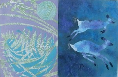
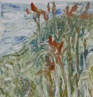
Walking my dogs in a field behind my home, we surprised two deer in the tall grasses. The light was fading and they hung in the air of blue shadows like ballet dancers and then disappeared into the night. I often combine two "pages" in an image, to create a visual story, to play off the abstract and representational, to savor the rich patterns and single moments.
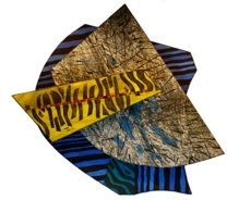
A Curious Dreaming of Jalak Balis
Syau-Cheng Lai
acrylic, ink, pastel, gold leaves on canvas
I work with soft pastels. Because I work outdoors on location, I tend to choose perfect days when the day itself tells you to stop and look closer at the world. I became interested in the idea of working outdoors at night. The night sky, the city lights kept calling my name. It seemed a bit impossible. After all, how am I going to see in the dark? This excerpt from The Artist, a poem by Charles Simic summed it up:
Do you remember the crazy guy
Who stuck candles in his hat
So he could paint the sea at night?
Alone on that empty Jersey beach,
He kept squinting in the dark,
And waving his brush wildly.
Candles. Not such a good idea. A headlamp. A better idea. If you happen to see a glow on the side of the road some night, slow down. It might be me.
Amu Darya is one of the major rivers tracing from Pamir glaciers which drains to Aral Sea in Central Asia. However, most of its water does not reach to Aral Sea due to the irrigation system built by the Soviet, and is lost in the desert. I imagine a different landscape with the ruins of ancient civilization in sight, perhaps from a fish's perspective.
Jalak Bali, a pure white staring with blue bare skin around its eyes, is an almost extinct endemic bird species in Indonesia. Hardly anyone sees it in the wildness anymore. So I imagine the bird In a dreamland..
A Memory of Blue Linna Doph
My grandmother DeeDom lived in a world of blue. Her carpet was blue. Her couch was blue. The walls of her Victorian apartment were pale blue, the heavy velvet curtains were slate. Her blue and white English china was complimented by Venetian blue wine glasses. Her car was blue. My mother made her a blue dress every year for Christmas. Her standard poodle, Canishe, bore a blue halo. She hosted luncheons at precisely noon, several days a week. A parade of blue haired old ladies would graciously stumble through her doorway. Occasionally I would muster up the courage to sneak into her room If unlucky, upon my entry, she would sit bolt upright in her blue bed and scream, " Get out, get out! I'm having a God-damned blue day!" The worst though, was that she always dressed in many shades of blue. Blue, blue, blue and as a child I hated it.
Many years later I came upon a study that focused on the color blue and its relationship with the aging of women. Its hypothesis was that as women age their perception of color changes which results in a tendency to develop a gradual increased affinity towards the color blue. At the same time and rate they increasingly dislike the warmer colors of the color wheel.
I have over the years been producing work that contains progressively more and more blue. Is the hypothesis correct or am I turning into my grandmother? I don't know or care, for with the addition of blue my work is finally, gradually, becoming more of what I have envisioned: more truthful and decidedly more blue.
My grandmother DeeDom lived in a world of blue. Her carpet was blue. Her couch was blue. The walls of her Victorian apartment were pale blue, the heavy velvet curtains were slate. Her blue and white English china was complimented by Venetian blue wine glasses.
SEE FULL STATEMENT BELOW
The blue of Blue Books is behind the stack of books by the Los Angeles artist, Ed Ruscha, that I photographed in 2000, using a large-format (20 x 24-inch) Polaroid camera. The subject pile consists of all the artists’ books by Ruscha in my personal collection, including one substantially physically altered so as to make it into a visual pun on the infinitely receding perspective characteristic of some early Ruscha paintings. Ed has become a blue chip artist, and his pictures hang on many expensive West Coast walls beneath the blue California sky.
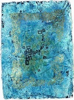
This work reflects the blue gray color of stones that are found in this area and the possibility of finding something embedded in them. Memory, time, preservation and transformation are part of my Motifs from My Back Yard works. I considered this work as an exciting exploration toward representing the plant forms I usually employ in my work with further uses of plants with foliage of varied colors such as those in the hosta families and others.
Impact (place holder)
Gregory Page
lithograph
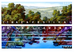
This small landscape painting was one of three designs I submitted to the Festival coordinator as an image to celebrate the 30th anniversary of the Ithaca Festival. It is an extension of how I have been treating the landscape for the past 15 years and that is with an incorporation of spaces and movements within shadows and areas seemingly out of our peripheral vision. The horizontal band through the middle emphasizes the separation between experienced vision and reflected vision, how the two are both similar and different at the same time. I was thinking that the Festival was in a mode of reflection over its past 30 years.
The painted image is made with transparent fluid acrylic on acrylic gel over gessoed illustration board panel. Texture is produced by modeling the acrylic gel while it is wet and and embedding in it, either permanently or temporarily, such things as aluminum foil ,that will give more interest to the texture. I show what I imagine to be the wonderful iridescent blues and greens reflected from light on coral and other sea creatures at the depths where Neptune surely had his Kingdom.
Neptune’s Kingdom
Marion Van Soest
acrylic on illustration panel
Blue Blood is a two part video piece consisting of an exterior projection and an interior installation
Through the flow of fluids life is transfered and sustained.We are in effect a self contained river moving even when sitting perfectly still.
The illusion of seeing blue blood flowing just underneath the skin is in a sense a metaphor for the hope, in our supposedly classless society, fo the potential for upward mobility .
Although we shun royalty and all of its pure or blue blood inclinations ... we are sold a dream in which the apex of hard work and faith will be in the end rewarded with lavish comfort and material security .
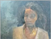
In my imagination and my life, painting has always been central. In art, I find meaning as a colorist, a realist (focusing on landscapes, cityscapes, and interpretive “meditations” based on extensive travel abroad) and a figurative painter of the portrait. I try to give voice to both narrative and literary sensibilities in the production of my work This is especially true of the work I have been doing over the past five years which attempts to examine the relationship between aesthetics and equity.

Blue. It's the color of our planet viewed from space. It is a primary color, spectrum wavelength
440-490 nanometers. It's a multifaceted metaphor and symbol used in music, art, literature and
world religions. It’s the ocean, sky, spirit, flight, deep thought. In many cultures blue is associated with intelligence, stability, calmness, peace and unity. Almost everyone likes some shade of blue.
Mainly Blue exhibits multiple viewpoints, media and explorations of the color blue.
Curator: Rebecca Godin